
Realistic portrait drawing comes down to one repeatable sequence: prepare your tools and reference photo, construct the head using proven proportion rules, block in your values from light to dark, refine each feature, then finish with contrast and highlights. Follow that order and you get likeness, believable form, and convincing light. Skip a step, and even skilled beginners end up erasing half the page. This process works whether you're picking up a pencil for the first time or you've been drawing for years but can't figure out why your portraits feel flat.
TL;DR:
- Following a structured construction sequence, especially using the three-thirds face proportion rule, is crucial for achieving realistic portrait likenesses.
- Using the correct pencil grades, appropriate paper textures, and timing layer buildup carefully protects paper tooth and enables rich shading.
- Accurate proportion measurement, such as eye placement and head-to-chin ratios, is more important than detailed shading for convincing lifelike results.
- Building textures with repeatable directional patterns and proper value blocks enhances skin realism without overworking or flattening the drawing.
- Consistent practice of feature-by-feature studies, focusing on construction and measurement, accelerates improvement more effectively than infrequent long sessions.
Table of Contents
- What Do You Need for Realistic Portrait Drawing?
- How Do You Build Accurate Head Proportions?
- How Do You Draw Realistic Eyes, Nose, Mouth, Ears, and Hair?
- How Do You Shade Realistic Skin Tone and Texture?
- How Do You Preserve Paper Tooth While Layering Graphite?
- How Do You Finish a Realistic Portrait and Fix Common Mistakes?
- What's a Good Practice Plan for Improving Fast?
- Who Teaches This Method?
- Why Most Portrait Advice Skips the Boring Part
- Ready to Practice With Guided Lessons?
- Sources
- FAQ
What Do You Need for Realistic Portrait Drawing?
You don't need a huge kit to draw realistic portraits from photos. You need the right grades, the right surface, and a reference photo that actually gives you something to work with.
Start with five pencils: 2H or H for your initial construction lines, HB for early value blocking, 2B for midtones, and 4B and 6B for your darkest shadows and deepest hair. Each grade earns its place. The harder pencils (H, 2H) lay down graphite without compressing your paper, while the softer ones (4B, 6B) deposit rich, dark carbon once you're ready to commit.
Paper choice matters more than most beginners realize. A smooth, hot-pressed surface gives you crisp detail for eyes and skin texture, while medium-tooth paper holds more graphite layers, which helps if you tend to build up dark values slowly. Either works, but pick one and learn how it behaves.
Round out your kit with:
- A kneaded eraser for gentle lifting and shaping highlights
- A white vinyl eraser for cleaner, harder erasing on final details
- Blending stumps in two sizes for smooth transitions on skin and shadow
- A quality sharpener that keeps a fine point without snapping graphite
- Fixative spray, optional, to seal a finished piece and prevent smudging
Before you draw a single line, fix your reference photo. Choose one with clear, directional lighting, not flat overhead light that erases your shadow shapes. Crop it tight on the face and shoulders, and bump up the contrast slightly so your shadow and midtone areas read clearly without crushing detail into pure black. Work in consistent light yourself, ideally from one side, so you can see your own graphite values accurately as you build them.
Pro Tip: Print your reference photo in grayscale before you start. Color photos trick your eye into misjudging value, and a black-and-white printout shows you exactly where the darks and lights actually fall.
If you want a deeper breakdown of what belongs in your kit and why, Brittanyclareart's tool guide walks through pencil grades and paper choices in more detail.
How Do You Build Accurate Head Proportions?
Every convincing portrait starts with construction, not detail. The Loomis method gives you a repeatable starting shape: draw a circle for the cranium, add a jaw block extending down and out from it, then divide the whole head into thirds to place your features consistently.
Those thirds aren't a suggestion. Anatomical proportion research confirms the face splits into three roughly equal vertical sections: hairline to eyebrows, eyebrows to the bottom of the nose, and nose to chin. The same research places the eyes at the halfway point of the entire head, measured from the top of the skull to the bottom of the chin, not just the visible face. Most beginners draw the eyes too high because they forget to account for the hairline and hair mass above the forehead.
Statistic Callout: The eyes sit approximately halfway between the crown of the head and the chin. Get that one measurement wrong and every other feature drifts out of place with it.
Once your thirds are marked, use these placement checks:
- Space the eyes one eye-width apart, measured from the inner corners.
- Align the bottom of the ears with the eyebrow line at the top and the bottom of the nose at the base.
- Center the mouth roughly one third of the way between the nose and chin, not dead center.
- Check nostril width against inner eye corners. On most faces, they line up closely.
- Re-measure against your reference using pencil sighting: hold your pencil at arm's length, thumb marking a distance, then compare that unit across other features.
A simple grid over your reference photo, even a rough one drawn in light pencil, catches proportion drift before you commit to shading. Step back from your drawing every ten minutes and compare it to the reference at a glance. Your eye catches errors from a distance that get lost when you're leaning in close.
How Do You Draw Realistic Eyes, Nose, Mouth, Ears, and Hair?
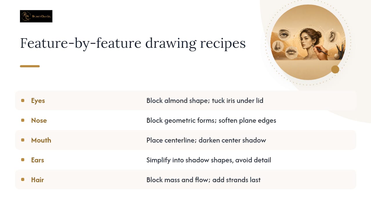
Every feature has its own repeatable recipe. Learn each one separately before you try to assemble a full face, since breaking construction into feature-by-feature practice builds skill faster than jumping straight into a complete portrait.
Eyes carry the most emotional weight in any portrait, so start with the underlying shape rather than the lashes. Block in the almond or elliptical form first, then drop the iris in as a circle that tucks partially under the upper lid, since a full round, floating iris is what makes amateur eyes look cartoonish. Map your highlight (usually a small bright spot on the iris) and the shadow the upper lid casts onto the eyeball before you touch a single lash. Build lashes last, using short, directional strokes that follow the curve of the lid rather than straight lines shooting outward like a starburst.
Nose confuses a lot of beginners because it has almost no hard outline in real life. Block it as a simple geometric form: a triangular wedge for the bridge, a rounded cylinder for the tip. Once that structure sits correctly, soften the plane edges gradually, paying special attention to the transition where the nostril wing meets the cheek. That transition should be a gradient, not a line.
Mouth placement starts with a light center line marking where the lips meet, not the outer edges. From there, build the upper lip's M-shape and the fuller lower lip mass around that centerline. The shadow directly between the lips acts as your anchor value: get that shadow dark and correctly shaped, and the rest of the mouth falls into place around it.
Ears rarely need heavy detail. Simplify them into a few connected shadow shapes rather than tracing every fold of cartilage, since over-rendering the ear pulls attention away from the face's focal points.
Hair should never start with individual strands. Block in the overall mass and silhouette first, identify the main direction the hair flows and where it clumps into sections, then add individual strands only as accents on top of that established form. Strand-first hair almost always looks pasted onto the head rather than growing from it.
How Do You Shade Realistic Skin Tone and Texture?
Value control decides whether a portrait reads as three-dimensional or flat, and it starts before you touch texture at all. Identify your four core value groups on the reference photo: the lightest lit planes, the midtones, the core shadow (the darkest transition between light and shadow), and any reflected light bouncing back into that shadow from a nearby surface.
Grouping tonal areas into large, clear value blocks before adding any micro-texture keeps the form readable at a distance. Skip this step and jump straight to texture, and your portrait ends up looking like a pile of unrelated marks rather than a face with structure.
Skin texture itself doesn't need to be complicated. Brittanyclareart's approach treats skin as a set of repeatable directional patterns rather than a thousand individual pores to render one by one. Small, consistent strokes following the same direction across a plane build convincing texture without turning into hours of tedious dotting.
For blending strategy, use these guidelines:
- Blend with a stump only in smooth areas like cheeks and forehead, where skin naturally lacks visible texture.
- Keep directional pencil marks visible in areas with more texture variation, like around the eyes or jawline stubble.
- Never blend over a highlight you intend to keep bright. Blending muddies the paper and kills contrast.
- Lift graphite with a kneaded eraser to create specular highlights rather than trying to draw around them from the start.
Pro Tip: Leave your brightest highlights as untouched white paper for as long as possible. It's far easier to darken around a highlight than to lift graphite back to pure white once the surrounding area is heavily worked.
If skin texture is the part of portrait drawing that trips you up most, Brittanyclareart's skin technique eBook walks through this exact patterned method in more depth.
How Do You Preserve Paper Tooth While Layering Graphite?
Paper tooth (the texture of tiny fibers that grips graphite) is what lets you build deep, rich darks. Press too hard too early with a soft pencil, and you flatten that tooth, leaving no grip for later layers. The fix is sequencing.
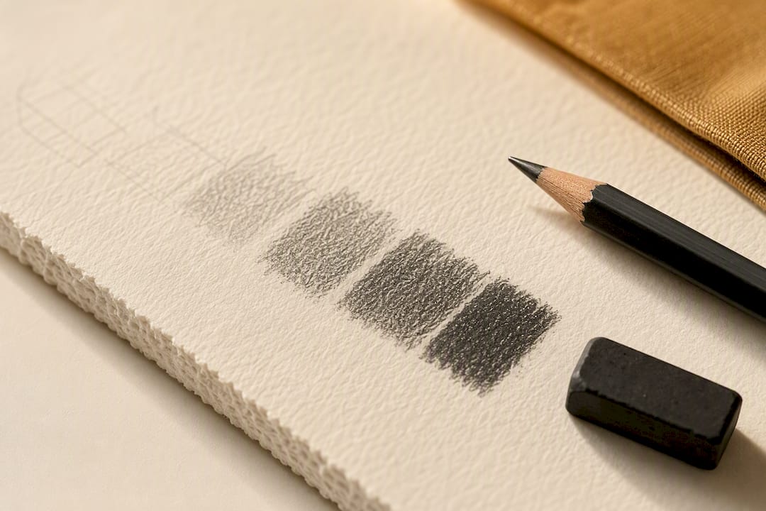
Statistic Callout: Once paper tooth is crushed flat, it severely reduces its ability to hold deeper values, which is why layering order matters more than final pencil grade.
Follow this progression:
- Start construction and early values with HB or 2H, using light pressure throughout.
- Move to 2B once your value map is established, building midtones in thin, repeated layers rather than one heavy pass.
- Bring in 4B and 6B only for your darkest shadows and hair, after the lighter layers underneath are already set.
- Avoid the softest pencils (7B and 8B) until the very final stages, reserved for the deepest accents.
- Build darks with directional cross-hatching rather than scrubbing back and forth, which burnishes the paper and creates unwanted shine.
This layering order also protects your highlights. Lifting graphite with an eraser works far better on preserved tooth than on a burnished, shiny surface where the eraser just smears rather than lifts.
How Do You Finish a Realistic Portrait and Fix Common Mistakes?
Before you call a portrait finished, run a quick final check. Re-measure your proportions against the reference one more time, soften any leftover hard outlines around the jaw or hairline, and push contrast specifically around your focal point, usually the eyes, so they stay the sharpest, highest-contrast area on the page.
Watch for these recurring problems:
- Eyes sitting too high on the head. Recheck the halfway measurement from crown to chin, not just across the visible face.
- Hard outlines around features that should transition softly. Soften with a clean blending stump rather than redrawing the line.
- Lost contrast in the final piece. Deepen your darkest shadow by one more layer and lift your brightest highlight slightly with an eraser.
- Overworked skin that looks smudged rather than textured. Reintroduce a few crisp directional strokes on top of the blended area.
Pro Tip: If a proportion looks off after you've already added shading, don't erase the whole section. Lightly re-measure, then nudge the edge of the shadow shape rather than the outline. Shadows read as form; outlines read as mistakes.
Know when to stop. A portrait pushed past the point of diminishing returns starts looking overworked and loses the lively, fresh quality that makes graphite drawings feel alive rather than labored.
What's a Good Practice Plan for Improving Fast?
Skill in realistic portrait drawing builds through short, frequent repetition rather than occasional marathon sessions. Structure your practice this way:
- Spend 5 to 15 minutes daily on quick head-shape and eye-placement studies, focused purely on construction accuracy.
- Dedicate 10 to 20 repetitions per week to a single feature (eyes one week, noses the next), tracking small, specific goals like "iris placement" or "nostril transition."
- Complete one full portrait per week from a single reference photo, checking your progress at four points: construction, value blocking, feature refinement, and final finish.
- Log each completed piece with the date and one specific note on what improved, so you can look back after a month and see measurable change rather than guessing.
Short, focused drills paired with weekly checkpoints build accuracy faster than infrequent long sessions, largely because your brain gets more repetitions of the correction cycle: try, compare, adjust.
Who Teaches This Method?
Tutorials on this topic often break realistic portrait drawing into the same construction-then-feature-then-texture sequence covered here, sometimes built around repeatable skin-texture techniques developed over time. Each lesson walks through the process step by step rather than assuming you'll figure out the gaps yourself.
Learners get structured lessons, downloadable reference photos matched to each tutorial, and specific tool recommendations so you're never guessing what pencil grade or paper to reach for. That kind of structured, guesswork-free progression is exactly what turns scattered practice into visible improvement. If the practice plan above appealed to you, Brittanyclareart's tutorial library picks up right where this article leaves off, with guided projects built around the same proportion and shading logic.
Why Most Portrait Advice Skips the Boring Part
The conventional wisdom on realistic portrait drawing leans hard on talent and "just keep practicing," and that advice quietly fails most beginners. What actually separates a convincing portrait from a flat one isn't raw drawing ability. It's whether you followed the proportion rules before you started shading, and whether you protected your paper tooth before you reached for a 6B pencil.
Most tutorials rush past construction because it looks unglamorous next to a finished, textured face. That's backwards. A rock-solid Loomis foundation and an accurate three-thirds measurement fix more portraits than any blending trick ever will. Skin texture, meanwhile, gets treated like a mystery reserved for advanced artists, when it's really a matter of learning a handful of repeatable directional patterns and applying them consistently.
If you take one thing from this whole process, prioritize measurement over mark-making. A portrait with imperfect shading but correct proportions still reads as a likeness. A portrait with beautiful shading and eyes set half an inch too high never will, no matter how many hours went into the texture.
— Brittany
Ready to Practice With Guided Lessons?
Some tutorial providers offer repeatable, tested skin-texture methods plus downloadable reference photos matched to lessons, assisting learners in understanding what a "good" reference or a correctly placed highlight actually looks like.

If you're just starting out, the Digital Downloads collection is the fastest way to get a structured starting project instead of piecing together advice from scattered videos. Intermediate artists ready for a full guided project should look at A Dark Beauty, a complete realism tutorial that follows the same construction-to-finish sequence covered in this article. And if skin texture is specifically where your portraits fall apart, the skin technique eBook breaks Brittany's patterned method into a focused 12-page lesson. Pick the one that matches where you're stuck, download it, and start your next portrait with an actual plan instead of a blank page and a hope.
Sources
A few sources back the core techniques in this article and are worth revisiting as you practice:
- Anatomical proportions research (PMC)
- How to Draw Realistic Portraits: Step-by-Step (Yourabbit)
- Graphite drawing techniques — Commission It
- How to draw a portrait in pencil — Artists & Illustrators
FAQ
How do you make a portrait look realistic?
Realism comes from accurate proportions first, then correct values, then texture, in that order. Get the three-thirds proportion rule right and your midtones mapped before you add any fine detail, since detail on top of wrong structure never reads as lifelike.
What is the 4-8-8 method of drawing?
This isn't a standard, widely recognized portrait construction method, and definitions of it vary depending on the source. The proportion system with real anatomical backing, and the one covered throughout this article, is the three-thirds rule paired with Loomis head construction.
What is considered one of the most realistic drawings ever made?
Hyperrealist pencil and graphite artists have produced portraits that are frequently mistaken for photographs, largely through obsessive value control and skin-texture technique rather than any single trick. The exact "most realistic drawing" title is subjective and changes depending on who's judging it.
Which artists are known for realistic portrait drawing?
Hyperrealism in pencil has a dedicated community of working artists who specialize in lifelike graphite portraits, often built on the same construction and layering principles covered here. Brittanyclareart's own tutorial library teaches a specific, repeatable version of this skin-texture approach for artists working toward that level of realism.
Do I need expensive materials to start drawing realistic portraits?
No. A basic set of five pencil grades, one type of paper, a kneaded eraser, and a blending stump covers everything needed to start, as outlined in the materials section above. Quality matters more than quantity when it comes to your tool kit.